 Choose Copernica for email
 Solutions for every type of email
 Improve your inbox placement
 Email specialist for your organization
 Personalized automations
 Campaigns with immediate results
 Personalization at scale
 Flexible data, powerful campaigns
 One platform for every interaction
 Easily build and deploy forms
 Track website visitor behavior
 Reach your audience with Google & Meta
 Follow-up manager
 Push notifications
 SMS module
 GDPR compliancy
 Testing mailings
 REST API/Webhooks
 Website forms
 Website crawler
 Coupons

 Advanced queuing
 Large volumes of email
 Full control and logging
 White papers
 Documentation
 Trainings
 Need more help?
 Our team
Prevent Yahoo! Mail from rendering your media queries
by Clayton van Oostwaard , Ralph van den Broeck
Update 10/3/2015: Yahoo let us know that hey have fixed this issue.
If you use media queries to create responsive HTML emails, this might lead to issues with Yahoo! Mail. This email provider ignores media query declarations and renders CSS as if it were outside of the media query. Or in other words, mobile optimized media queries could cause Yahoo! Mail to always show the mobile version of an email if someone opens it on a desktop computer. Well after a good search on the 'Google Internet' I found a nice solution for that: attribute selectors.
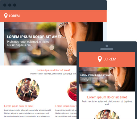
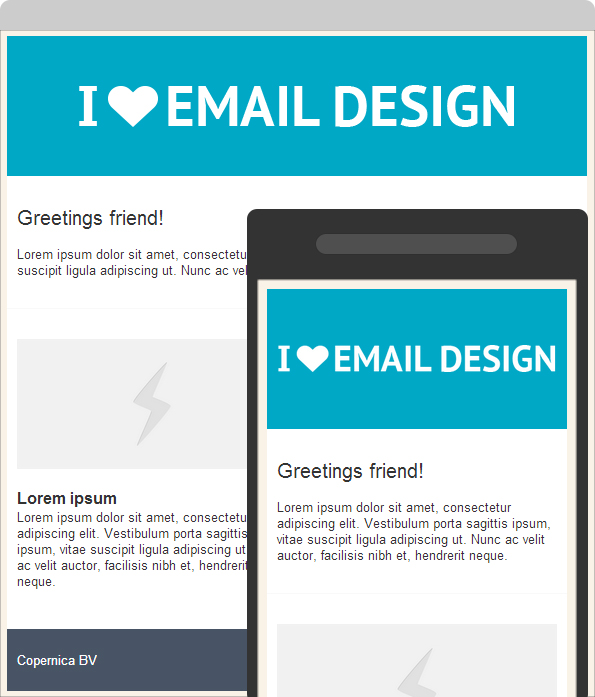
Example
The following screenshot shows two versions of the same email in Yahoo! Mail on a desktop. In the first version, where the desktop version is shown correctly, attribute selectors were used. In the other version, attribute selectors weren't used, causing Yahoo! Mail to show the mobile version.

Why does this happen?
Yahoo! Mail grabs your media query declaration, strips away the media type e.g. (@media only screen and (max-width: 480px)) you have set and converts or prefixes your css class names into something unique.
The original media query:
<style>
    @media only screen and (max-width: 480px) {
        .responsiveImage img {
            height: auto !important;
            max-width: 100% !important;
            width: 100% !important;
        }
    }
</style>
is converted to:
<style>
    #yiv4262010176 .yiv4262010176responsiveImage img {
        height: auto !important;
        max-width: 100% !important;
        width: 100% !important;
    }
</style>
How do I use attibute selectors to solve this issue?
Using attribute selectors in your HTML is easy. By adding (or better yet: making up) an attribute selector in your body tag, you can use that selector to force Yahoo! Mail to ignore your media query rules (Thanks, EmailonAcid). Why will this work you ask? Attribute selectors are not supported. That way the CSS inside your media query is not applied to the HTML email. In this example, I made up a yahoofix attribute:
<body yahoofix>
    <table>
        <tr>
            <td>
                <p>Foo bar</p>
            </td>
        </tr>
    </table>
</body>
...
<style type="text/css">
    @media only screen and (max-width: 480px) {
        body[yahoofix] table {width: 100% !important;}
        body[yahoofix]  p {color: #e91112;}
    }
</style>
Will this affect my email on mobile devices?
If the email client on your mobile device supports media queries, then it will render perfectly. So you have nothing to worry about.
Have fun testing!
If you have anything to add, or need any help, please let me know in the comments section.