 Transactional emails
 Email creation
 Deliverability
 Personalized emails
 Large volumes
 European data security by design
 Automated communication
 Customer journey
 Campaigns with immediate results
 SMS campaigns
 Monitoring website traffic
 Personalization at scale
 Email editor
 Push notifications
 Layered database
 Testing mailings
 REST API/Webhooks
 Website forms
 Website crawler
 Coupons
 GDPR compliancy
 Web based dashboard
 Advanced queuing
 Large volumes of email
 Full control and logging
 White papers
 Documentation
 Trainings
 Need more help?
 Our team
 Career
How to create a responsive HTML email from scratch
by Clayton van Oostwaard , Richard Hordijk , Ralph van den Broeck
You must have heard this question before: will our newsletter look nice on an iPhone? Or, why doesn't our email look just as nice as our competitor's email? I'm going to teach you how to create an email template that will look nice on an iPhone, Android or Windows8 phone. In other words, today you are going to learn how to create a responsive HTML email from scratch.
Before you continue…
I'm assuming you already have the necessary skills for developing HTML emails. Therefore I will not get into the nitty gritty details of things to take into account when you're coding for different email clients. However, I will cover specific responsive issues. But basic knowledge of HTML/CSS should help you on your way. Not want to go through the hassle? Try our new ResponsiveEmail.com service.
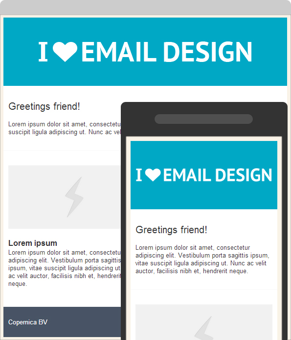
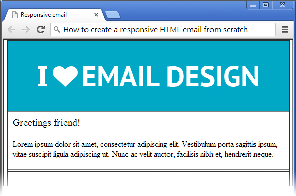
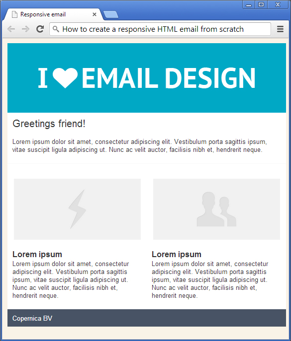
Final product
What you'll be creating is an email that looks great on a desktop computer and a mobile (smart)phone like an iPhone. See below.
The Basics
Every HTML document starts with a DOCTYPE, followed by the HEAD section, BODY and so on. Create a new HTML document and use the following code:
<!DOCTYPE html >
<html>
<head>
<meta http-equiv="Content-Type" content="text/html; charset=utf-8"/>
<meta name="viewport" content="width=device-width, initial-scale=1.0"/>
<title>Responsive email</title>
<style type="text/css">
body{margin: 0; font-family: arial, sans-serif;}
</style>
</head>
<body>
<table border="1" cellpadding="0" cellspacing="0" width="100%">
<tr>
<td>
Hello Mars!
</td>
</tr>
</table>
</body>
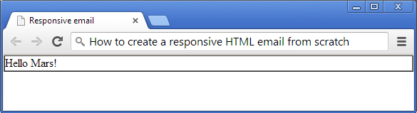
</html>Nothing extraordinary as you can see, except for the viewport meta tag. Basically this tag tells the email client (or browser) to assume that the email is as wide as the screen width of the device. I'm using a table as container that spans across the full width of the page. You can also use this container to style your email with a background color since CSS stylings on the body tag is ignored by a couple of email clients. Let's call this table the main container throughout this post.
Note: Make sure you set the cellpadding and cellspacing to zero to prevent weird spacing issues in Outlook. For the sake of this tutorial I’m leaving the border of the table on so you can see the process.
Your HTML page should look like this:
Layout structure
Next is the layout structure of the design. Let's go back to the final design you saw at the beginning of this post:
- First we have the header, which contains an image.
- Second an introduction
- Third I have two columns and last but not least the footer.
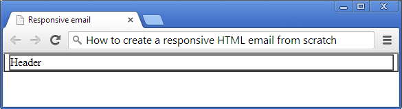
Coding the layout structure: header
The header will be wrapped inside of the main container table you saw earlier. The one that spans across the full width of the page. The code is as follows:
<table border="1" cellpadding="0" cellspacing="0" align="center" width="640">
    <tr>
        <td>
            Header
        </td>
    </tr>
</table>
Make sure you've placed the code above inside the main container table.
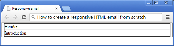
Coding the layout structure: introduction
The structure of the introduction is similar to the header, so go ahead and copy that code and paste it below the header code.
<tr>
    <td>
        Introduction
    </td>
</tr>
Your HTML page should look like this:
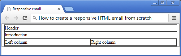
Coding the layout structure: two column article
One of the characteristics of a responsive email is that for example two columns aligned next to each other, are stacked on top of each other when viewed on a smaller screen. The first approach, for a non-responsive design, would be to create a single table with two table cells inside. But that would make it difficult to play nice on smaller screens. So we are going to create two tables next to each other instead. The table on the left will need to align to the left and the right table will of course need to align to the right. Take a look at the following code:
<tr>
    <td>
        <table border="1" cellpadding="0" cellspacing="0" align="left" width="49%">
            <tr>
                <td>
                    Left column
                </td>
            </tr>
        </table>
        <table border="1" cellpadding="0" cellspacing="0" align="right" width="49%">
            <tr>
                <td>
                    Right column
                </td>
            </tr>
        </table>
    </td>
</tr>
Place this code right below the 'introduction'. Your HTML page should look like this:
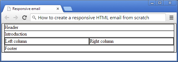
Coding the layout structure: the footer
The footer looks a lot like the header structure doesn't it? Go ahead and copy the code of the header and paste it below the two columns.
    <tr>
        <td>
            Footer
        </td>
    </tr>
Your HTML page should look like this:
Content & style
You should now have a solid foundation of the layout structure of the email design. We can start adding content and different styles to make it look shiny and all. And most important make it look nice on a mobile device.
Adding content & style: header
The header only consists of a single image. So that's easy. Replace the text 'Header' with an image of your own or the one available in the source files you can download. Take a look a the code below:
<tr>
    <td bgcolor="#00A8C6" style="font-size: 0; line-height: 0; padding: 0 10px 0 10px;" height="140" align="center" class="responsive-image">
        <img src="logo.png" alt="" />
    </td>
</tr>
Before you say anything, I'm aware that I'm using padding. Padding doesn't work well in email clients. But believe me, it's safe to use padding on TD tags but not on <div> or <p> tags. Remember that you must always specify every value (top, right, bottom & left). I've added a special class, responsive-image, that I'm going to explain to you later regarding responsive design.
Adding content & style: introduction
The introduction section consists of a title, a short summary and a horizontal gray line used as a seperator. To keep things simple I'm using break tags (<br /> for new lines and the content is placed inside divs to be able to style them separatly. For instance: setting the font size of the title 'Greetings friend!' to 20px.
White-space is an important factor in design and creating white-space when coding HTML for email can sometimes be a pain. I'm using padding to create white-space around the introduction. The bottom part of the introduction gets an extra 10px. When padding is not the right solution for your design, you can always use spacers to create white-space. I use a slightly different technique that doesn't require an image as a spacer. Here is an example:
<tr><td style="font-size: 0; line-height: 0;" height="30"> </td></tr>Simply set the font-size and line-height of the container, in this case a TD tag, to zero and set the height of the container to the amount of white-space you would like to create. Don't forget to fill the TD tag with since email clients don't like it when you leave your table cells empty. It can break your email layout for example.
So, I'm using the 'image-less' spacer technique to create the gray horizontal line instead of using the good old <hr> tag. The main reason is because Outlook ignores the styling you apply to the tag to make it nice and thin.
This is the code
<tr><td style="font-size: 0; line-height: 0;" height="1" bgcolor="#F9F9F9"> </td></tr>
<tr><td style="font-size: 0; line-height: 0;" height="30"> </td></tr>
Notice the extra 'spacer' code I've added below the gray line? This is because padding would not have worked. The padding would have added extra pixels and make the line a bit thicker than it should.
Your code should look like this:
<tr>
<td style="padding: 10px 10px 20px 10px;">
<div style="font-size: 20px;">Greetings friend!</div>
<br />
<div>
Lorem ipsum dolor sit amet, consectetur adipiscing elit.
Vestibulum porta sagittis ipsum, vitae suscipit ligula adipiscing ut.
Nunc ac velit auctor, facilisis nibh et, hendrerit neque.
</div>
</td>
</tr>
<tr><td style="font-size: 0; line-height: 0;" height="1" bgcolor="#F9F9F9"> </td></tr>
<tr><td style="font-size: 0; line-height: 0;" height="30"> </td></tr>And your HTML page should now look like this:
Adding content & style: columns
Let’s add some images and content to the columns. I'm using divs so the content behind the title will start on a new line. Throw in a break tag for extra white-space if you like.
Add an image
<tr>
    <td style="padding: 0 10px;" align="center" class="responsive-image">
        <img src="ph1.png" width="240" alt="" />
    </td>
</tr>
<tr><td style="font-size: 0; line-height: 0;" height="20"> </td></tr>Add a short summary. I'm using lorem ipsum.
<tr>
    <td>
        <div style="font-weight: bold; font-size: 16px;">Lorem ipsum</div>
        <div>
            Lorem ipsum dolor sit amet, consectetur adipiscing elit.
            Vestibulum porta sagittis ipsum, vitae suscipit ligula adipiscing ut.
            Nunc ac velit auctor, facilisis nibh et, hendrerit neque.
        </div>
    </td>
</tr>
Add extra white-space below the summary
<tr><td style="font-size: 0; line-height: 0;" height="20"> </td></tr>
Repeat above for the right column and your code should look like this:
<tr>
<td>
<table border="1" cellpadding="0" cellspacing="0" align="left" width="49%">
<tr>
<td style="padding: 0 10px;" align="center" class="responsive-image">
<img src="ph1.png" width="240" alt="" />
</td>
</tr>
<tr><td style="font-size: 0; line-height: 0;" height="20"> </td></tr>
<tr>
<td>
<div style="font-weight: bold; font-size: 16px;">Lorem ipsum</div>
<div>
Lorem ipsum dolor sit amet, consectetur adipiscing elit.
Vestibulum porta sagittis ipsum, vitae suscipit ligula adipiscing ut.
Nunc ac velit auctor, facilisis nibh et, hendrerit neque.
</div>
</td>
</tr>
<tr><td style="font-size: 0; line-height: 0;" height="20"> </td></tr>
</table>
<table border="1" cellpadding="0" cellspacing="0" width="49%">
<tr>
<td style="padding: 0 10px;" align="center" class="responsive-image">
<img src="ph2.png" width="240" alt="" />
</td>
</tr>
<tr><td style="font-size: 0; line-height: 0;" height="20"> </td></tr>
<tr>
<td>
<div style="font-weight: bold; font-size: 16px;">Lorem ipsum</div>
<div>
Lorem ipsum dolor sit amet, consectetur adipiscing elit.
Vestibulum porta sagittis ipsum, vitae suscipit ligula adipiscing ut.
Nunc ac velit auctor, facilisis nibh et, hendrerit neque.
</div>
</td>
</tr>
<tr><td style="font-size: 0; line-height: 0;" height="20"> </td></tr>
</table>
</td>
</tr>Note: Just like the image in the header, I've added a special CSS class 'responsive-image' to the container of the images.
Your HTML page should look like this. By the way, I seem to have turned off the borders of my tables in this screenshot and added a bit of basic CSS styling. Not to worry, update the CSS inside the HEAD with the following code:
<style type="text/css">
    body {margin: 10px 0; padding: 0 10px; background: #F9F2E7; font-size: 13px;}
    table {border-collapse: collapse;}
    td {font-family: arial, sans-serif; color: #333333;}
</style>

Adding content & style: footer
The footer will only need a name and a background color. No Rocket Science there.
<tr>
    <td bgcolor="#485465" style="padding: 10px 10px 10px 10px; color: #FFFFFF;">
        Copernica BV
    </td>
</tr>
Your HTML page should now look like this. You're almost there!
Add some responsiveness
I'm using media queries to make things responsive. Media queries is a technique to make an HTML design act responsive. Another technique is to create your designs fluid by using percentages for widths. Media queries give you a bit more control over your design.
Place the code below in HEAD section of your email HTML document. You can paste it right after the last CSS styles you've placed a few steps earlier. I'll break it down in the next paragraph.
<style type="text/css">
    @media only screen and (max-width: 480px) {
        body,table,td,p,a,li,blockquote {
        -webkit-text-size-adjust:none !important;
        }
        table {width: 100% !important;}
        .responsive-image img {
        height: auto !important;
        max-width: 100% !important;
        width: 100% !important;
        }
    }
</style>
What the media query code tells mobile email clients (and browsers) is that below the 480px threshold, a mobile-friendly layout should be displayed
The width of every table is set to 100% width. And I'm using !important to over-ride the fixed-widths from tables.
The '.responsive-image' class does almost the same for tables, but only for images.
Note: Media queries only work when embedded into the HTML. Basically this means that you cannot use it as inline styles.
Quick tip if you're using Copernica Marketing Software
Copernica has a very handy tool that puts your CSS inline, which is really what you should be doing anyway. Having said that, after you have created your email template in Copernica, make sure you set the style setting to keep the <style> blocks and convert to style= attributes. You can find the style setting in the dropdown menu of the selected email document.
That's it!
If you have followed the steps above you should now have an email that looks great on mobile devices! Now go and impress your clients or boss. Please do share your own design or if you have any tips, let us know!
Create fully responsive emails without HTML and CSS
Do you want to create fully responsive emails without any of the hassle of HTML and CSS? Try our new ResponsiveEmail.com service.