

The flexible marketing automation platform
Easy to get started, advanced features - you're in control


Looking back on a successful webinar
More information
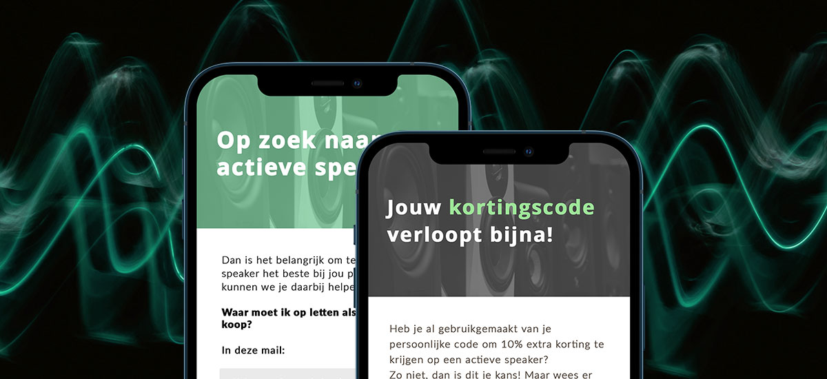
Explore the potential
Engage the right audience and personalize every interaction. Copernica brings together email expertise, marketing automation, and advanced data to deliver flexible, dependable, and impactful multi-channel communications.
Built on decades of email expertise, Copernica empowers organizations with flexible, reliable, and personalized email communication.
Marketing Automation
Copernica transforms customer data into smart, automated campaigns that reliably deliver the right message to the right customer at the right time.
Data
Our platform handles simple customer details to complex datasets, supporting advanced segmentation and real-world structures.
Multi-channel
Leverage data from multiple sources in a single platform to deliver a seamless customer journey across email, web, social, and SMS.
Why you should choose Copernica?
Website Tracker
Optimize customer interaction with smart website trackers.

Marketing Automation
Email marketing platform that helps businesses manage and optimize campaigns.

Deliverability
Unify and enrich in our customer data platform to power personalized, cross-channel campaigns.

Email-editor
Our software allows you to deliver the right email, at the right time; reliably, at scale, with personalized impact.

Support
We help you with strategy, customization, and achieving maximum results.
Which copernica product is right for you?
Copernica offers three powerful solutions for professional communication. Each product is designed for a specific audience and application. Discover below which product best suits your situation.

Marketing automation platform
Copernica Marketing Software is an all-in-one solution for Marketing teams, CRM managers, and Organizations focused on customer relationships.
- Managing campaigns across email, sms, and web
- Segmentation and personalization
- Automation and reporting

Cloud based e-mailsystem
SMTPeter is a cloud service to optimize your outgoing emails with authentication, statistics and improved deliverability.
- Template support
- No technical expertise needed
- Send securely and quickly

Mail transfer agent
MailerQ is an on-premise Linux-based Mail Transfer Agent (MTA) for delivering large volumes of email per day.
- Advanced queuing
- Large volumes of email
- Full control and logging
Customer success stories
An exclusive insight into the best email marketing campaigns, written in collaboration with our partners.

Mailmeisters generates more revenue with these automations
With the right marketing automations, you can convert visitors into buyers, save time, and make every message feel personal. In this case, we show how Mailmeisters uses essential automations via Copernica to achieve immediate results and strengthen customer relationships
MaxiAxi achieves 705% growth in email marketing
With smart email automations, MaxiAxi boosted revenue by 705% in four years, improved efficiency, and made every customer touchpoint more meaningful. In this whitepaper, we show how phased campaigns and automated journeys helped them achieve rapid growth and measurable results.

Smartphonehoesjes boosted email revenue by 200%
Smartphonehoesjes.nl set up email campaigns based on website behavior, like an abandoned browser campaign that encourages visitors to complete their purchase. They also improved reactivation campaigns to re-engage inactive customers via email.
Backed by our Partner Network
Our 300+ partners extend the power of our software, helping you implement, customize, and maximize results.


Copernica news
The latest news of Copernica, product updates, events and new features.